The creative layer of the Guesteria system: the icon alphabet, the ten-curve canon, their worked pairings, the composition rules, and the mockup galleries.
Constant width, round caps, looping once and never closing (logobook p01, p08, p18).
palette rhythm
1 Primary
2 Sub-prime
3 Structure
4 Subtone
the alphabet
lockup
type
Aa
Display / Body
Skyline
staff · operations
Earthy Comfort
guest · comfort
app icon
the mark
off-product
Real photography, washed to palette.
canon
10
handcrafted curves
restraint
1
accent per surface
19 Creatives
The system, applied off-product
A creative recolors and retypes the system; it never invents a second brand. Every off-product surface reuses the same violet ramp, the same Codec Pro display and Source Sans 3 body pairing, and the same graphic language - the bell-swirl mark, the connecting line unrolled from it, and the line-built icon set (see 05 Visual language) - tuned for each format. One accent device per view.
The line is a single continuous open monoline, constant width, fully rounded end caps, smooth curves only, looping over itself at most once but never closing (logobook p01, p08, p18). Its colour is one flat tone of its ground — off-white on neutral, a lighter tint of violet on a LIGHT-violet --brand-50 field, slate-blue on navy — or full brand violet #826AFF to pop on a photo (logobook p04, p08, p12, p17). On a SATURATED --brand-600 field the line knocks out off-white #FFFDF5; --brand-200 there is the adjacent ramp step and vanishes. Never gradient, tapered, dashed, or outlined; off-palette colour is an explicit don't, with a green lockup and a yellow-on-black lockup both struck out (logobook p06).
The brand mark is the REAL logo only, and the full lockup is the default. Which file belongs on which ground is logo 3, and what breaks the mark is logo 4. Every applied surface places the full wordmark lockup (assets/logos/guesteria--logo.svg on light grounds, guesteria--logo-light.svg on dark or saturated grounds, with the capsule / violet / lavender variants as the ground asks); the lockup is ONE element, never a bare icon plus a separate "Guesteria" text node. The bare circle mark (guesteria--icon.svg, viewBox 0 0 256 256) is reserved for the icon's strict slots — the app-icon tile and a favicon-type tile — though a creative MAY also reach for it as a SHORT logo at small / square scale (apparel, sticker, a corner stamp), ground-correct and still one mark per creative. No fabricated glyph, no coloured-square placeholder, no hand-drawn bell stands in for it (logobook p01, p15).
Icon language - the real line-built glyphs
The set is FIVE glyphs and the master owns it (dmd 7): heart, house, location, phone and a filled document. This facet renders the four MONOLINE files from assets/icons/ at their native viewBox 0 0 96 96 — icon--heart.svg, icon--location.svg, icon--house.svg and icon--phone.svg — each a single stroke, round caps, single-ink, recoloured via the disc's colour; the fifth, icon--document.svg, is filled rather than stroked and is shown at dmd 7.
Heart
Location pin
House
Phone
Curve x palette x background
The line takes a NEAR-TONE of its ground (logobook p04, p08, p12, p17). The SAME real curve from the canon (curve-1--top-right.svg) is rendered once per sanctioned line colour on its MATCHING ground; a gallery cell that shows a curve WHOLE takes a .curve-frame whose aspect-ratio matches the curve's viewBox, so slice shows the same shape legibly in every line colour.
Violet on light violet.var(--brand-600)#826AFF (or the lighter var(--brand-200)#C7BCFF) on a light-violet var(--brand-50)#F2F0FF field - the brand ground (logobook p12, p14). Skyline blue on blue.var(--ctx-1-700) on a var(--ctx-1-50) ground - the staff / operations near-tone, the brand's Skyline family (logobook p16 navy frame, p18 divider). Earthy on warm.var(--ctx-2-700) on a warm var(--ctx-2-50) ground - the guest / comfort near-tone, the brand's Earthy Comfort family (logobook p08, p11). Off-white on navy.#FFFDF5 on a navy #2D2F44 ground - the knockout tone the cover uses (logobook p01, p18).
A curve's stroke is coloured by ROLE: a SUBJECT curve (the gallery, a hero with no heading over it) is DISTINGUISHABLE from its ground; a BACKING curve behind a bare heading is a NEAR-TONE of the ground (the same light/dark zone, low contrast) — never a knockout line under a same-tone title. A bold line stays only where it is the subject AND the heading rides a .tagwrap pill. Text over a saturated ground is high-contrast (#fff for headings, or the focus phrase wrapped in a rounded .tagwrap).
Every curve in a creative frame uses ONE non-breakable fill model: inside a position:relative; overflow:hidden frame, a .curve-fill div holds the source svg at its OWN viewBox with preserveAspectRatio="<ALIGN> slice". The slice covers the format (uniform scale, no distortion) and pins the curve's NAMED edges off-frame, so the rounded line ENDINGS are never visible. <ALIGN> is the curve's named edges, fixed per curve: top-right curves use xMaxYMin (curve-1 608x467, curve-2-2 279x151, curve-6-2 267x347), bottom-right curves use xMaxYMax (curve-2-1 291x541, curve-3-1 306x345, curve-5-1 247x132). A curve MAY be rotated in 90-degree steps and MAY be mirrored, provided the transform is applied to the PATH inside the viewBox (never a CSS transform on the element, which leaves the box unrotated so slice covers the old box) and the ALIGN is REMAPPED to the edges the transform moved the line onto. Untransformed, each layout simply picks a curve whose natural named edges suit it; the frames on this page that mirror curve-3-1 and curve-5-1 do it through the mask path, with the mask's own boundary carrying the mirror.
Icons + curves, together
The two motifs combine in creatives: a real icon disc seats at the END of a curve sweep so the line "drops off" the icon, or NESTS inside a curve's loop like a bead on a thread. Four worked pairings — always a real curve recoloured to its ground plus a real glyph file, never a new shape, never an off-palette colour (logobook p13, p14, p25).
Heart on curve-1
The icon--heart.svg disc sits where the hero loop (curve-1) ends, on var(--brand-50) — the line drops off the icon (logobook p14).
Pin in curve-2-1 loop
The icon--location.svg disc nests inside the enlarged loop (curve-2-1), off-white line on the #2D2F44 navy — icon within the curve (logobook p25).
House on curve-3-1
The icon--house.svg disc rides the high end of the Skyline routing thread (curve-3-1), var(--ctx-1-700) on var(--ctx-1-50) (logobook p14).
Phone on curve-6-2
The icon--phone.svg disc seats at the foot of the Earthy backdrop loop (curve-6-2), var(--ctx-2-700) on var(--ctx-2-50) (logobook p13).
Composition approach (the golden rule)
Every surface obeys the golden rule: (1) ONE ANCHORED CLUSTER - group the headline, supporting copy and the lockup into a single block (a .cre-cluster) seated on a third, the lockup sized to the headline, never scattered to opposite corners with a dead middle; (2) CURVE AS COUNTERWEIGHT - the curve's mass fills the rest of the frame OPPOSITE the cluster, balancing it across the centre; (3) AIR AND SAFE MARGINS - generous, even margins; if it does not fit, cut copy, not margins (logobook p06, p15); (4) SCALE CONTRAST - type, logo, line and icon each sit at a clearly different scale, never two elements fighting at the same weight; (5) ONE PER SURFACE - one accent line, one CTA, one idea per surface (logobook p17).
Vary the format across four patterns: top-cluster / center / side-band / diagonal; each frame below names its pattern.
Tag wrapper - focus a phrase, a sentence, or a paragraph
When text runs close in color to the shape/ground behind it, wrap it in a .tagwrap (real DOM, not inline styles). It scopes any span: one word, or a whole sentence, or a paragraph. Its corner radius follows the roundness stance (see 06 Shape & roundness) - a paragraph wrapper's radius stays at or below its horizontal padding, and a WHOLE paragraph carries generous VERTICAL padding.
I go to school in the morning.
A whole sentence, scoped into one pill.
A whole paragraph can sit inside the wrapper when the photo or shape behind it would otherwise swallow the text. Balanced padding, a radius that stays under the padding, easy to replicate.
The four off-product formats
Formats: small (1:1 post, 4:5 story/poster, icon tiles, app tile), medium (business card, 8:5 ad), full-width (letterhead, wide banner), and fullscreen 16:9 slides. Every frame reuses the violet ramp, Codec Pro headings, one REAL open monoline (round caps, no gradient, recoloured to its ground via the curve files above) from the master curve system, grounded in a logobook page.
Social media
1:1 and 4:5 frames. A giant brand icon (house, location pin, or heart) blows up until it bleeds off-frame, with a line tail running out of it so icon and connector read as one stroke; the lockup pins bottom-center (logobook p16). One icon per frame.
Posters / Print
Portrait posters bleed one hero curve off the frame; the business card carries the full lockup and the tagline on one grey and one violet face; the A-frame routes a line from headline to a corridor photo; the letterhead loops a quiet line behind the body copy. On a photo, the lockup knocks out white over a 30% dark mask (logobook p07).
Presentation slides
16:9. One message per slide, generous margins. Section dividers run the line full-bleed, entering one edge and exiting another to imply continuation (logobook p12, p18).
Ads
Multiple sizes from one layout: logo, one line of copy, one CTA reusing the primary button. At small or product scale (apparel, app icon, door hangers) the free line is dropped and the icon alone carries the identity (logobook p21-p24).
The bulkier galleries (Social, Posters/Print, Slides, Ads, and the curve-masked photo splits) are swipe carousels (.cre-carousel scroll-snap tracks with prev/next arrows, data-carousel-autoplay="6000"); the engine JS pauses on hover/focus, respects reduced-motion, and the track swipes natively with JS off.
Social mockups
Stories (vertical). The enlarged-loop watermark. One icon per frame, rotated for variety — the book shows house, location pin, and heart at giant scale on grey, violet, and navy frames — with the lockup pinned bottom-center and the icon in a near-tone of the ground (logobook p16). Facebook / LinkedIn. The swirl or location-pin motif is enlarged and laid across the seam between a solid brand colour field and a photo, overlapping the boundary; here the motif may go full brand violet #826AFF to pop against the photograph (logobook p17). Frames and rhythm. Use 1:1 and 4:5 frames, one idea per post, headline in Codec Pro display; the line-built icons (logobook p13) also tile as 1:1 brand stamps.
Social 1:1 / 4:5seven frames
Post 1:1top-cluster · logobook p16 / p13
Every guest, cared for.
From first message to check-out.
The enlarged loop curve-2-1 at near-tone var(--brand-200) on a var(--brand-50) field, with the real icon--heart.svg disc seated at the sweep (logobook p16, p13).
Guest post 1:1top-cluster · ctx-2 ground
Your stay, made simple.
Everything ready before you arrive.
The hero loop curve-1 in Earthy var(--ctx-2-700) on warm var(--ctx-2-50) — a SUBJECT line, so the headline rides a .tagwrap pill to clear it (logobook p08, p11).
Staff post 1:1top-cluster · ctx-1 ground
One console, every property.
Desk, housekeeping and maintenance in sync.
The routing thread curve-3-1 in Skyline var(--ctx-1-700) on blue var(--ctx-1-50); the copy rides a .tagwrap where it crosses the line (logobook p16).
Story 4:5side-band · logobook p16 / p01
Find your place.
Off-white #FFFDF5 enlarged loop curve-2-1 on navy #2D2F44 with the real icon--location.svg disc (logobook p16, p01).
Story 4:5top-cluster · logobook p12 / p14
Booking to check-out.
The hero loop curve-1 in off-white #FFFDF5 bleeding off a var(--brand-600) field — the sanctioned knockout pop on violet, never --brand-200 (logobook p12, p14).
Icon tiles 1:1center · logobook p13
The real line-built glyphs as 1:1 brand stamps — heart, pin, house, phone — single-ink on var(--brand-50) (logobook p13).
Post 1:1glass island · photo
A welcome that travels.
The brand reads over any photo — a frosted island lifts the line off the image, the border catches the light.
A liquid-glass .island.glass.glass--ink over a real photo (bg-7.jpg): the DARK frost and light text keep the copy crisp over the image, the logo holding the top-left at the same padding (theme.liquid-glass).
Photo, curve-masked
Real brand photography (assets/bg-0.jpg .. assets/bg-7.jpg) meets a colour splash across a FULL-BLEED brand curve: the bigger part carries the message, the photo fills the rest, and the boundary is cut from a REAL master curve (curve-3-1, curve-5-1), never a generic arc. Each of the four .photo-split creatives carries its own inline clipPath (cm-1 .. cm-4) traced from a real curve's normalized path and closed along the frame edges. The photo also carries a matching colour wash. The brand mark appears ONCE per creative — the full lockup rides WITH the cluster, so the photo side carries at most a FUNCTIONAL icon-disc in a CONTRAST tone, never the brand logo-disc again and never the lockup's colour, toward the TOP and clear of the copy. Each carries a headline → subtitle → body stack knocked out in #fff; the focus phrase rides a rounded .tagwrap pill whose colour differs from BOTH the splash AND the text — a same-colour pill vanishes (logobook p07, p17).
Photo + curve splitcm-1 .. cm-4
Split 16:9brand splash · photo right · curve-3-1 edge
Every guest, cared for.
From first message to check-out.
The whole stay runs on one calm console — staff and guest, one timeline.
Brand var(--brand-600) splash carries the headline + subtitle + body; the real photo (bg-1.jpg) fills the right behind a brand wash, the boundary cut from curve-3-1; the focus phrase in an INK .tagwrap pill that differs from the violet splash (logobook p17, p07).
Split 16:9staff splash · photo left · curve-3-1 mirrored
Run it all, one screen.
One console, whole portfolio.
Housekeeping, front desk and maintenance, all in sync.
Staff var(--ctx-1-800)#2E4258 splash on the right; the real photo (bg-3.jpg) fills the left behind a slate wash, the boundary cut from curve-3-1 mirrored; the location-disc top-left on the photo side, the phrase in a light staff pill (logobook p07).
Split 16:9guest splash · photo right thirds · curve-5-1 edge
Feel at home, from hello.
The welcome starts before arrival.
Check in early and find everything ready the moment you walk in.
Guest var(--ctx-2-800)#443F2C splash takes two-thirds; the real photo (bg-5.jpg) fills a thirds sliver on the right behind an earthy wash, the boundary cut from curve-5-1; the light lockup leads the cluster, one mark per creative (logobook p07).
Split 16:9navy splash · photo left thirds · curve-5-1 mirrored
Calm, premium, service-grade.
One system, off-product too.
The brand carries to any surface without a redesign — one system, every surface.
Navy #2D2F44 splash takes two-thirds; the real photo (bg-6.jpg) fills a thirds sliver on the left behind a navy wash, the boundary cut from curve-5-1 mirrored; the violet heart-disc rides the photo side, the phrase in a violet pill that differs from the navy splash (logobook p01, p07).
Tinted photo + photo badge
Two more ways the system meets real photography (logobook p07). Tinted photo (.photo-tint). A brand or context colour WASH over a real bg-N.jpg via mix-blend-mode: multiply — brand var(--brand-600) over bg-0.jpg, staff var(--ctx-1-800)#2E4258 over bg-2.jpg, guest var(--ctx-2-800)#443F2C over bg-4.jpg, dark #2D2F44 over bg-7.jpg. The knockout headline always rides #fff. Photo badge (.photo-badge). A real mark seated in a disc on a tinted photo, never a fabricated medallion wordmark: the disc holds a REAL asset only — an icon glyph or the bare mark assets/logos/guesteria--mark.svg.
Tint · brand
The guest experience platform
Brand var(--brand-600) wash over bg-0.jpg; the knockout headline rides #fff (logobook p07).
Tint · staff
Operations, automated
Staff var(--ctx-1-800)#2E4258 wash over bg-2.jpg (logobook p07).
Tint · guest
A warm welcome, every time
Guest var(--ctx-2-800)#443F2C wash over bg-4.jpg (logobook p07).
Tint · dark
One brand, every touchpoint
Dark #2D2F44 wash over bg-7.jpg (logobook p07).
Badge · icon-in-circle
Icon-in-circle: the real icon--heart.svg glyph in an off-white disc on a brand-washed photo.
Badge · mark-in-circle
Mark-in-circle: the shipped bare mark guesteria--mark.svg seated in an off-white disc — a REAL asset, never a fabricated medallion.
Badge · ink disc
The knockout pairing: the off-white bare mark guesteria--mark-light.svg on a navy is-ink disc.
Poster mockups (portrait 4:5)
Discipline. High contrast, a single baseline rule under the headline (the same rounded baseline bar the mark already carries), generous margins. Capsule-cropped imagery is the house photo shape; on a photo, knock the logo out white over a 30% dark mask (logobook p07). Six portrait 4:5 posters, each a DIFFERENT format pattern — top-cluster, center, side-band, diagonal, photo. Every one keeps the logo TOP-LEFT, the same edge padding, large Codec Pro type, and a single REAL curve recoloured to its ground. Off-palette colour is a don't (logobook p06).
Posters 4:5six frames
Poster 4:5top-cluster · logobook p12 / p14
We craft inspiring guest experiences
Large type, one bold violet hero loop curve-1 in var(--brand-600) bleeding off the foot, on var(--brand-50); the line is the SUBJECT, so the headline rides a .tagwrap pill (logobook p12, p14).
Poster 4:5center · logobook p01 / p18
Calm, premium, service-grade.
Off-white #FFFDF5 hero loop curve-1 on the #2D2F44 cover navy; the centred title rides an ink pill so the SUBJECT line stays the subject (logobook p01, p18).
Poster 4:5diagonal · logobook p08
Feel at home from the first message.
Earthy enlarged loop curve-2-1 in var(--ctx-2-600) on warm var(--ctx-2-50) — the logo holds the top edge, the copy the bottom third, the line the diagonal between (logobook p08).
Poster 4:5side-band · logobook p16 / p26
One console, every property.
Skyline routing thread curve-3-1 in var(--ctx-1-700) on blue var(--ctx-1-50); the headline holds the left band at mid-height, the line the right (logobook p16, p26).
Poster 4:5side-band · logobook p11
Set up in days, not months.
Ambient backdrop loop curve-6-2 in off-white #FFFDF5 on a var(--brand-600) field — the knockout pop, never --brand-200; the headline rides an ink pill on the opposite band (logobook p11).
Poster 4:5photo · liquid glass · island
Run every property from one screen.
A frosted island lifts the promise off the photograph — the room reads through the blur, the copy stays crisp.
A POSTER on a real photo (bg-4.jpg): the headline rides a liquid-glass .island.glass.glass--ink, so the type reads BRIGHT over imagery without a solid slab; the logo holds the top edge, knocked out over the 30% dark mask (theme.liquid-glass; logobook p07).
Business card + A-frame
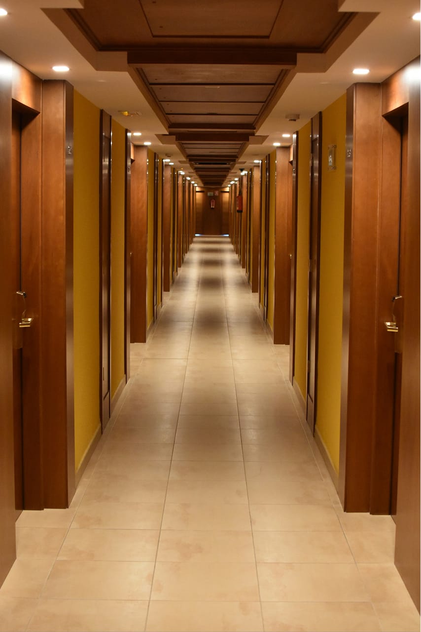
Business card. Two faces, one grey and one violet, carrying the full wordmark lockup and the tagline "We craft inspiring guest experiences" (logobook p15); single-ink mark, no shadow, no outline, generous air — no baseline rule between the lockup and the descriptor. Street A-frame. A violet board pairs wordmark and copy with a line that connects the headline block down to a capsule-cropped photo of a corridor — the line routing the eye from message to proof (logobook p26).
Business card · grey facelogobook p15
We craft inspiring guest experiences
The grey face: the full wordmark lockup above the tagline "We craft inspiring guest experiences," single-ink mark, no shadow, no outline (logobook p15).
Business card · violet facelogobook p15
We craft inspiring guest experiences
The violet face: the light lockup above the same tagline, generous air — no baseline rule between the lockup and the descriptor (logobook p15).
A-framelogobook p26
Your front desk, always on.
A violet board routes the off-white #FFFDF5 line curve-3-1 from the headline down to a real tinted corridor photo (bg-2.jpg) — message to proof, a clean field instead of a stripe pattern (logobook p26).
Letterhead (full-width)
A document with the wordmark and body copy, with a quiet line that loops up from a corner and travels across the page as a routing thread behind the text (logobook p19).
Letterheadlogobook p19
An ambient backdrop loop curve-1 in light-violet var(--brand-200) travelling across the page behind the body copy — quiet but still distinguishable on white (logobook p19).
Slide mockups (16:9)
Where body copy runs close to the line or ground it rides a rounded .tagwrap: .tagwrap--word (1-2 words), .tagwrap--line (a whole sentence), .tagwrap--block (a whole paragraph).
Slides 16:9four frames
Title slide 16:9logobook p14
Guest experience, end to end.
Hospitality, one calm flow.
A BACKING near-tone var(--brand-700) hero loop curve-1 recedes on the var(--brand-600) field so the white title leads; the body's focus words ride a .tagwrap--word (logobook p14).
Content slide 16:9logobook p14
Everything, in one place
The line carries from the title and drops off the location-pin badge.
The routing thread curve-3-1 continues behind the content and terminates near the real icon--location.svg badge; the whole sentence rides a .tagwrap--line (logobook p14).
Guest slide 16:9logobook p08
A stay they remember
Check in early, find everything ready, and chat in your own language.
A BACKING near-tone Earthy var(--ctx-2-200) loop curve-1 recedes on warm var(--ctx-2-50) so the title leads; the body sits on a .tagwrap--block (logobook p08).
Divider slide 16:9logobook p12 / p18
Part 02 — Operations
The line full-bleed curve-1 in slate #6D82A3 on the navy #2D2F44 — a low-contrast line at 3.4:1, drawn from the neighbouring Skyline family (hue 217 against the navy's 235), so the centred #FFFDF5 title leads at 12.9:1 — entering and exiting to imply continuation (logobook p12, p18).
Twin spread - vertical pair + horizontal pair
TWO EQUAL panels carry ONE line. The same continuous path (curve-2-1) is inlined in BOTH panels; each panel's viewBox WINDOWS its half of the shared coordinate space, so the line connects across the seam at one scale while the curve sits contained (margin) inside two same-size panels. The VERTICAL pair splits the window top/bottom (violet palette); the HORIZONTAL pair splits it left/right (navy palette). Each panel's aspect-ratio equals its window's W/H; the headings ride fully-round ink pills so the line stays the subject (logobook p12, p18).
Vertical pair (stacked, EQUAL panels, one violet palette - the same line windowed top/bottom)
The journey starts here
...and ends with a smile
Two EQUAL panels; the SAME line (curve-2-1) is windowed top/bottom (the viewBox y-split at 296.97), so it connects straight down the seam at one scale and sits contained with margin — one violet palette, headings on fully-round ink pills (logobook p12, p18).
Horizontal pair (side by side, EQUAL panels, one navy palette - the same line windowed left/right)
The journey starts here
...and ends with a smile
Two EQUAL panels; the SAME line is windowed left/right (the viewBox x-split at 296.97), so it crosses the vertical seam as one navy monoline at one scale, contained with margin (logobook p12, p18).
Slide deck (16:9) - ten common templates
A presentation is the same system at 16:9. Each of the ten templates reuses the ramp, type scale, and ONE curve from the canon; the cover and closing slides pair the lockup with the headline; photos are real assets/bg-*.jpg tinted by the photo system. One message per slide.
1 · Title / cover
Calm, caring, precise.
Guest experience platform for hotels
2 · Agenda
Agenda
The tokens
The curve canon
Off-product formats
3 · Section divider
01
The system
4 · Statement / quote
"A creative recolors and retypes the system; it never invents a second brand."
5 · Bulleted content
The curve canon
Ten real curves, never redrawn
One accent line per view
Recolor and retype, never redesign
6 · Two-column
Console
White, dense; one shell, three roles.
Mobile
Two apps: warm guest, cool staff.
7 · Big stat
10
handcrafted curves in the canon - recolor, never redraw
8 · Image-full + glass island
Real property, frosted
A dark colour wash over a real photo, the copy lifted off it by the frosted island (logobook p07).
9 · Image + text split
Photo + text
Half photo, half copy - the split keeps one clear reading order, the photo tinted to its context.
At small or product scale the free line is dropped and the icon carries the whole identity; the line collapses back into the mark (the collapse-to-mark rule) (logobook p21, p22, p23, p24).
Apparel
A white tee with the line-built violet heart icon at the chest (logobook p21); a violet tee with the white bell/cloche glyph at the chest (logobook p22).
logobook p21 / p22
App icon
A violet #826AFF rounded-square tile with the white bell glyph, shown on a phone home screen (logobook p24).
logobook p24
Door hangers & ads
Navy and white hangers carrying a QR code and the wordmark (logobook p23). Ads: one layout, multiple sizes - logo, one line of copy, and one CTA that reuses the primary button (violet --brand-600#826AFF, hover --brand-700#532DF5).
logobook p23
Ad mockups (8:5 + app tile)
Three 8:5 ad units, the app-icon tile and the apparel sticker; each carries one REAL curve recoloured to its ground, on-palette only (off-brand colour is a don't, logobook p06).
Ads 8:5 / app tile
Ad 8:5navy · logobook p24 / p06
Set up in days, not months.
A navy #2D2F44 frame carries the full light lockup, one line of copy, and one CTA reusing the primary button (violet #826AFF, hover #532DF5); slate routing thread curve-3-1 on navy, on-palette only (logobook p24, p06).
Ad 8:5brand ground · logobook p12 / p14
One brand, every guest touchpoint.
Off-white hero loop curve-1 in #FFFDF5 on a var(--brand-600) field — the knockout pop, never --brand-200; the line is the SUBJECT, so the headline rides an ink pill. Logo, one line, one CTA (logobook p12, p14).
Ad 8:5guest ground · logobook p08
Check in before you arrive.
Earthy enlarged loop curve-2-1 in var(--ctx-2-600) on warm var(--ctx-2-50); the primary CTA stays violet (logobook p08).
App icon 1:1logobook p24
A violet #826AFF rounded-square tile with the white bell glyph — the shipped guesteria--mark-light.svg, the line collapsed into the mark (logobook p24).
Apparel / sticker 1:1short logo
The SHORT logo — the icon-logo (guesteria--icon.svg, the mark in its dark disc) — as a woven patch or sticker on a warm var(--ctx-2-50) ground.
Banner mockups (wide)
Two full-width leaderboard banners: logo, one line, one CTA, a single REAL curve sweeping the strip (logobook p06).
Banner widebrand ground · logobook p12
The guest experience platform
A BACKING near-tone var(--brand-700) loop curve-1 recedes on var(--brand-600) so the lockup + headline lead; logo, one line, one CTA (logobook p12).
Banner widenavy ground · logobook p06 / p24
Operations, automated
Slate routing thread curve-3-1 in #6D82A3 on #2D2F44; the primary CTA stays violet (logobook p06, p24).
Rendered examples (across sizes)
Small (social), medium (banner, ad), fullscreen 16:9. Each reuses the ramp, type, and ONE curve from the canon (see 05 Visual language > The curve canon) as the counterweight, recolored to its ground and never redrawn.
Each frame applies the golden rule (see 05 Visual language > Shape as background).
Social post 1:1
One idea, one post.
The enlarged loop curve-2-1 as a BACKING near-tone var(--brand-200) on a var(--brand-50) ground (logobook p16).
Banner
Calm, caring, precise
No line at strip scale: lockup, one line, one CTA on var(--surface-canvas) - cut copy, not margins (logobook p06).
Ad
Headline first
One line of copy, one action.
The routing thread curve-3-1 as a BACKING, slate var(--ctx-1-700) at 3.4:1 on the var(--brand-800) ink ground; logo, one line, one CTA (logobook p24).
Slide 16:9
Section title
One message per slide. The curve, overscaled and cropped, carries the eye from title to content.
The ambient backdrop loop curve-6-2 in light-violet var(--brand-200) on var(--surface-canvas) (logobook p14).
Creative random generator
A CONTROL SIDEBAR drives a RULE-VALID creative: lock the Palette / Mode / Logo form / Aspect or leave them on Auto, toggle the Icon / Focus-wrap / Logo / Accent, then Shuffle. The colours stay DERIVED from color.rhythm - a control only chooses WHICH rhythm cell. Works with JS off (a default creative stays). (components.generator)
One system, applied off-product.
Recolor and retype, never a second brand.
Content island + liquid glass
A .island is a rounded content block that lifts two-to-three paragraphs off a coloured / photo ground. Its corner radius TRACKS the type size (--radius-island, an em; the roundness stance lives in 06 Shape & roundness). Add .glass to frost it into an Apple-style liquid-glass panel (a backdrop-filter blur, a luminous border, an inset highlight, a float shadow - background AND border); the same material rides the .tagwrap focus-wrap. Glass is over-a-ground only. (components.content-island + theme.liquid-glass)
Solid island
Held off the line
On the letterhead, an ambient backdrop loop travels behind the body copy; the island keeps the paragraph legible without competing with the line (logobook p19).
Solid .island on a brand field - the letterhead pattern.
Liquid glass . ink
Frosted over the cover navy
The block with .glass.glass--ink: a DARK frost over the cover navy #2D2F44 (logobook p01, p18), so the LIGHT text reads through the blur; the copy stays legible if blur is unsupported.
.island.glass.glass--ink over a dark field - ink frost, light text.
Liquid glass . light
Frosted over Earthy Comfort
Over the warm guest ground, the default .glass light frost keeps DARK text; a liquid focus-wrap rides the same material - one calm guest surface.
.island.glass over a light field - light frost, dark text + a liquid focus-wrap.
Liquid glass — light frost vs ink frost
CONTRAST RULE: the default .glass is a LIGHT frost so its text is DARK (use over a LIGHT ground); .glass--ink is a DARK frost so its text is LIGHT (use over a DARK ground or photo). A light frost with light text vanishes. With backdrop-filter unsupported the @supports fallback keeps copy legible.
Glassover a photo . 3 paragraphs
Read over the room
A multi-paragraph block stays legible over a busy photograph because the ink frost refracts the image into a calm field.
A single paragraph rarely needs the island — reach for it at two or three.
The frost keeps the photo present; the luminous edge keeps the block distinct.
.island.glass.glass--ink over bg-0.jpg — THREE paragraphs lifted off the image.
Glassover a photo . 2 paragraphs
A welcome that travels
The brand reads over any photograph — the frosted island lifts the line off the image, the border catches the light.
One device, every surface; the photo stays present behind the calm field.
.island.glass.glass--ink over bg-7.jpg, right-aligned — a second liquid block in front of imagery.
More liquid — colour & photo
More of the liquid approach: frosted .island.glass wrap-blocks and liquid .tagwrap focus-wraps, over a COLOUR field and over a real photo.
Liquid glass . colour field
Guest warmth, frosted
A liquid island over the Earthy field — the ink frost keeps the light copy crisp without a solid slab.
.island.glass.glass--ink over an Earthy colour field — ink frost, light text.
Liquid glass . photo
Lifted off the photo
The frost refracts the room into a calm field; check in early and find everything ready.
A liquid island + a focus-wrap over bg-7.jpg — glass--ink, the pill a contrasting violet.
Every stay reads as one calm thread — run it from one console, every surface.
A poster-scale LIQUID focus-wrap (.tagwrap.tagwrap--block.glass.glass--ink) over bg-4.jpg — the phrase frosts the same way the island does.
The same material on the focus-wrap
Over a dark photo use .glass--ink (light text); the wrapper padding tracks the type so it never dwarfs the copy. ONE focus-wrap per paragraph, and the phrase never breaks mid-word.
Every stay runs on one calm console — staff and guest, on a single timeline.
Creative rules
The discipline every creative follows - the curve canon and roundness stance from the Master, applied off-product.
One curve per surface. A creative carries ONE curve from the canon (05 Visual language > The curve canon), recolored to its ground - never two competing lines, never a hand-drawn addition. Do not invent a curve; fill a cell with a canon path and recolor it, nothing else.
Colour by role. A SUBJECT curve is DISTINGUISHABLE from its ground; a BACKING curve behind a bare heading is a NEAR-TONE of it. A bold line stays only where it is the subject AND the heading rides a .tagwrap pill.
Distinguishable accent. The curve must clear its ground by ≥ ~3 ramp steps (light on dark/saturated, or dark/saturated on light; never an adjacent step - brand-200 on brand-600 vanishes).
Tagwrap. Body copy that runs close in colour to the line or ground behind it rides a .tagwrap; its text is a calm, less-prime tone, never a second accent.
Composition. One anchored cluster, the curve as counterweight, no dead middle, one accent line / one CTA per surface. Every edge element sits the SAME distance from the frame (--cre-pad).
Collapse to the mark. At small or product scale (apparel, app icon, door hangers) the free line is dropped and the icon alone carries the identity (logobook p21-p24).
Curve as background. A curve may also be the BACKGROUND - overscaled past the frame, ghosted over a photo, or bled off a single edge; see 05 Visual language > Shape as background. It stays a subtone backing - near-tone over colour, a faint wash over a photo.
Content island + glass. A .island lifts a multi-paragraph block off a busy ground, its radius tracking the type; .glass frosts any over-a-ground wrapper (island or .tagwrap) - never the plain page.
Motion (inferred - not in the book)
iThe open path with rounded ends invites a "draw-on" reveal, but the Logo Guide shows no storyboard, no motion spec, and no timing. Any "the line draws itself" guidance is inferred, not in book (logobook, motion section).
Assets
The un-editable brand artifacts (logos, icons, curves, photos) ship as real files in assets/ beside this document. Recolor a curve via its stroke per ground, an icon via stroke=currentColor; never redraw the logo. (reference.assets)
One row per file, with its viewBox and the slice / align rule that pins it. Recolour a token, never redraw a mark; marks are inlined from the source svg (recolour the fill / stroke only).
Path
What it is
Usage rule
assets/logos/guesteria--logo.svg
Wordmark lockup, navy #2D2F44 ink, vb 512x136
The full lockup - the DEFAULT on every surface (header, card, posters, ads, slides, letterhead, social) on light grounds. Never re-letter.
The lockup on a navy / cream / violet / lavender pill, vb 512x136
The background-by-ground pill; pick the pill that is a near-tone of the ground.
assets/logos/guesteria--icon.svg
Mark in a navy #2D2F44 disc, vb 256
The circle mark - the icon's strict slots (app-icon, favicon) AND the SHORT logo on a creative at small / square scale (apparel, sticker, stamp), in place of the full lockup.
assets/logos/guesteria--mark.svg
Bare mark, navy, no disc, vb 256
Seat in a .photo-badge disc or over a light field.
assets/logos/guesteria--mark-light.svg
Bare mark, off-white #FFFDF5, no disc, vb 256
The knockout bare mark - seat on a navy is-ink badge disc, or on a violet app-icon tile.
assets/logos/guesteria--mono.svg
Wordmark in currentColor, vb 512x136
Single-ink; recolour via the parent's color, one flat tone only.
Single-ink; recolour via the parent's color, inline or as a file. No literal ink to edit out.
assets/icons/icon--document.svg
Filled document glyph in fill="currentColor", vb 96
Single-ink; recolour via the parent's color. The one filled glyph - no stroke.
assets/icons/icon--*--bg.svg
Glyph in a #C7BCFF disc, vb 128 - the disc keeps that palette tint, the glyph inherits currentColor
Pre-disced icon stamp; use where a tinted disc is wanted. One filename breaks the pattern: the mate of icon--document.svg ships as icon--documents--bg.svg, plural.
assets/curves/curve-1--top-right.svg
Hero connector, vb 608x467
In a .curve-fill, preserveAspectRatio="xMaxYMin slice"; near-tone stroke.
assets/curves/curve-2-1--bottom-right.svg
Enlarged loop, vb 291x541
xMaxYMax slice, pairs with curve-2-2 for twins.
assets/curves/curve-2-2--top-right.svg
Short companion arc, vb 279x151
xMaxYMin slice; the twin closer.
assets/curves/curve-3-1--bottom-right.svg
Routing thread, vb 306x345
xMaxYMax slice; also a photo-split mask edge.
assets/curves/curve-5-1--bottom-right.svg
Shallow sweep, vb 247x132
xMaxYMax slice; a thirds photo-split mask edge.
assets/curves/curve-6-2--top-right.svg
Ambient backdrop loop, vb 267x347
xMaxYMin slice, quiet ground sweep.
assets/curves/ (curve-3-2, 4, 5-2, 6-1)
The rest of the handcrafted set
Same rule: pin the named edge with slice, near-tone stroke.
assets/curves/divider-{1,2,3}--wave*.svg
Full-width wave dividers
A derived full-width rule: .divider-wave with preserveAspectRatio="none", never a cropped-corner brand curve.
assets/bg-0.jpg .. bg-7.jpg
Real brand photography
Tint (.photo-tint), curve-mask (.photo-split) or badge (.photo-badge); knock type out #fff.
Five real handcrafted glyphs - heart, house, location, phone, and a filled document - are the icon source of truth. The Logo Guide's own creatives chapter names eight line-built icons (logobook p13), but only these five were ever produced as files; cup, bed / lounger, dumbbell / key, steam, and swirl have no shipped SVG. The curve canon is the ten handcrafted curves - curve-1, twin 2-1 / 2-2, twin 3-1 / 3-2, curve-4, twin 5-1 / 5-2, twin 6-1 / 6-2; never invent an eleventh.
Rule: every creative is a recolor-and-retype of the system, never a redesign. If a creative needs a token the system lacks, add it to the system first.